
❤Revamping the Website Experience ❤
Design For America
.png)
Overview
My team and I had the opportunity to work with Design for America which is a student-led UCSD organization that has been running for 6 years. Our stakeholders thought their website lacked visual branding, proper formatting (unreadable via mobile device), and in-depth project information.
We partnered with them to create designs that incorporated brand colors and designs, updated the images to better reflect the organization’s brand, and created a more organized interface overall for a more visually pleasing website. In addition, our designs included a mobile mockup that was more legible and easier to navigate compared to the current mobile view.
.png)
As a contracted UX designer, I established a formal connection between our stakeholders and executed weekly meetings. In addition, I developed clickable prototypes, user-interviews, and set soft deadlines to ensure that our weekly milestones were met in time. From January 2022 to March 2022, this 11 week project was designed and executed by my team and I.
❤ ❤ ❤
The Problem
Upon entering the website, users don’t get a strong sense of what DFA is or what it wants to be with a lack of visuals and a few scant project pages. To the average individual, the website looks visually barren and outdated with its confusing layout. On mobile, users are bombarded with overlapping text and project pages that only appear to be clickable, but don’t provide any further information.

❤ ❤ ❤
Goals
Our stakeholders wanted an update to both their desktop and mobile version of their website. For them, it’s all about adding new features while maintaining the website’s core design foundation for easier implementation. They want higher website traffic while still remaining true to their original branding.
.png)
❤ ❤ ❤
Chipping Away With Research
We wanted to get general feedback regarding DFA and its website, so we got to work surveying 13 individuals and personally interviewing 7 individuals.
.png)
User Interviews:
-
Who did we interview?
-
7 UCSD students ages 18-22 showed interest in DFA
-
They had active roles in the UCSD design community and other design clubs.
-
Over half learned about DFA projects and applications exclusively through social media platforms
-
Only 3 individuals were aware of the DFA website
-
2 out of 3 individuals had a negative experience on the DFA website
-
-
-
We asked questions about:
-
Knowledge of DFA as a whole
-
What they look for in a design organization
-
Why they are interested in DFA
-
Their major and reason for giving back to the design community
-
❤ ❤ ❤
❤
❤ ❤ ❤
❤
❤
.png)
Key Insights:
-
Humans are visual individiuals and enjoy a balance of compelling visuals with light text.
-
Confusing layouts and vague descriptions will make individuals less engaged.
-
Providing a calendar or active links helps keep the viewer actively engaged in the club.
❤ ❤ ❤
❤ ❤ ❤
Information Architecture
Playing with Concepts

DFA User Flow

❤ ❤ ❤
Three different features → One big solution
Our main design goals would be to change the overall layout of the website and include more images and information for visual branding. We decided to ask the DFA organization for new assets that included photos of social activities during COVID-19, hex codes, and important information that must be included while fixing the overall layout of the website.
_____________________________________________________________
❤ ❤ ❤
________________________________________________________________
1) Updated Visual Aid → Improved Branding
From our general research and interviews, we learned that humans are visual creatures. Thus, the incorporation of more images into the initial homepage would provide better branding for DFA as a whole. There were many visual assets we wanted to incorporate, so we decided to incorporate different perspectives of the organization to further cement the organization’s branding of being student-led.

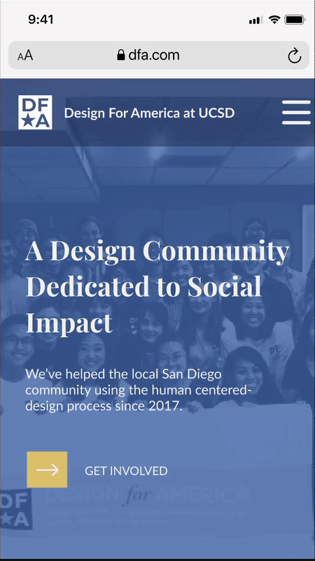
Instead of a stagnate photo with shapes like the original website, our group pitched the idea, to our stakeholders, of having a photo carousel which would scroll through multiple photos of the organization. We received positive feedback as it would help to provide a better visual aid for users while providing visual branding for DFA.
_____________________________________________________________
❤ ❤ ❤
________________________________________________________________
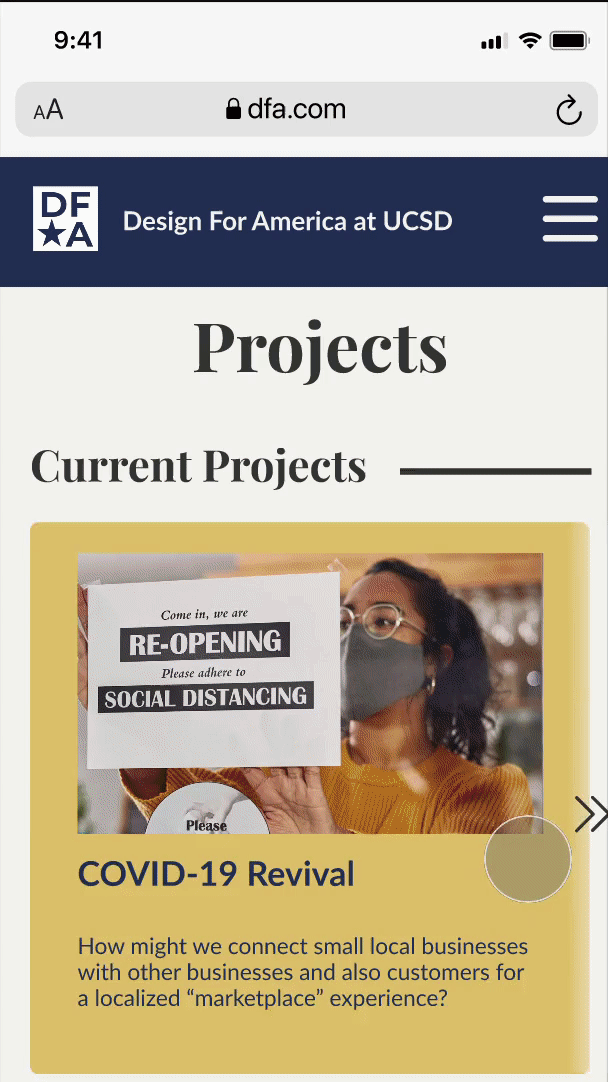
2) Improved Project Page → Improved User Experience
Project pages should be clickable and include additional information about specific projects, but this does not seem to be the case with the DFA website. Text was condensed into one small paragraph and didn’t provide additional resources for its users which ruined any positive interpretation the user may have had. As such, we set out to create a more in-depth and modular project page for all the projects involved.
.png)
Instead of a stagnate photo with shapes like the original website, our group pitched the idea, to our stakeholders, of having a photo carousel which would scroll through multiple photos of the organization. We received positive feedback as it would help to provide a better visual aid for users while providing visual branding for DFA.
_____________________________________________________________
❤ ❤ ❤
_____________________________________________________________
3) Better Get Involved → More prospective members
Most people know that the “Get Involved” page is supposed to attract curious newcomers into joining a club. However, DFA’s “Get Involved” page had inconsistent branding and lack of visual content which didn’t help to solidify any new members. In addition, users were left confused as the “Stay Updated” section at the bottom was more of a point of contact rather than an updated event page.

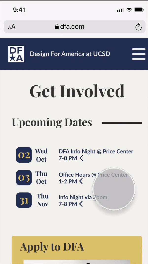
Thinking in the headspace of a new incoming member, it helped individuals be more proactive about joining DFA as they were able to see what incentives came with joining. Additional user testing proved that users thought this format of event activities helped to provide them with updated content that they may have missed via social media. Our iteration gained positive feedback as it helped to provide additional information in a condensed format.
❤ ❤ ❤
Final Results
Although we didn’t personally see our design being implemented straightaway and its impact, stakeholders stated that our product was a major improvement over the original website and stated that they would be keeping the prototypes in hopes to implement such a design.

Overall, our stakeholders were happy with the results and gave us amazing critiques on how we could improve our iterations during our weekly meetings which gained us real-world design experience.
❤ ❤ ❤